Saturday, 3 May 2014

Question 7


QUESTION 7


Looking back at your preliminary task, what do you feel you have learnt
in the progression from it to the full product?


From the very start of the year, when designing my school magazine, I have learnt a great deal of information about the music industry, including functions, audience and distribution. I have also learnt a lot about the technologies and program software used to actually create the magazines, as we were lucky enough to have those programmes in our school.

This is my final outcome of the preliminary task, undertaken in the end of 2013. The magazine’s name was ‘The Sixth Former’ which was a suitable name for the chosen magazine title – informing people about sixth form life in King Henry VIII School. The masthead is poorly placed, taking up a lot of room at the top of the page, which could’ve been used for other information or additional cell lines. As well as the masthead, the main image isn’t at its full potential.

The editing of the image, in this case; the cropping around the actual person, is very edgy, making the image look unprofessional. Because of the poorly placed masthead, I was unable to make the image any bigger, unaware of the difference it would've made. The colour scheme of the magazine isn't very tasteful. The colours tend to clash and make the magazine look quite childish, challenging the fact that we, as sixth formers should be looked at as ‘young adults,’ not children or regular pupils.

There is a lot of dead space within the cover, and it really should have been filled. I think the speech bubbles, used to highlight the cell lines are an inconvenience as they take up too much space.

Besides all of the mistakes I may have made when producing this page, at the time I was unaware of what was coming in the future and what I would have learnt and most definitely gained from the experience. I was fairly proud of this final outcome at the time and received a pleasing grade.

As you can see, there is a huge difference in my quality of work from the start of the year. My work, as a whole, just look a lot better. 

The main image of my final cover looks much more professional. The quality of the image is a lot better than before, and the way I have cropped around the picture is much less jagged, therefore making it look realistic. 

My pug now matches to my chosen colour scheme. This, again, makes it look more professional, corresponding to the colour scheme.  

The whole layout of the page is more structural than my school magazine; for example my cell lines are spread out over the page, not crowding around the main image. This takes the full attention off the main image and focusing on the information too. 

Overall, I have improved immensely throughout my media production, and I wish to participate in such a subject next year. 

Question 5


QUESTION 5

How did you attract/address your audience?

My audience, being a younger generation of Rock / Indie lovers, were targeted through my pictures and choice of music. I used a number of pictures in my magazine, predominantly younger generations of 16 – 18 year olds.
This factor influences teenagers to read the magazine, in relate to the stars. Therefore, my audience will be on the same wave-length as the music artists featured within the pages, resulting in a more ‘trust-worthy’, ‘friend-like’ document.

The whole set-up of the magazine is deliberately similar to ‘Q,’ who share a similar target audience as I do, other than a generation below.

Ultimately, my magazine could be looked upon as a ‘Q Magazine for Teens,’ appealing to my target audience, knowing the content is somewhat similar to one of the leading music magazines on the market.

My article, based on my fictional music group ‘False Society,’ is about a young group of boys who had hit over night fame, and how it has changed their lives. 

I think I speak for every other teenager who’s greatly interested in music, when I say; becoming famous overnight would be ‘a dream come true.’ This scenario sets up a sense of inspiration for young readers. They read the article, seeing through the groups eyes, and maybe relating to it.


Tuesday, 22 April 2014

Question 6

Question  6

"What have you learnt about technologies from the process of constructing this product?"

Throughout the making of my media magazine I have used a number of different programmes:
  • Adobe InDesign
  • Adobe PhotoShop
  • Blogger
  • Prezi
  • SlideShare
  • Microsoft PowerPoint
A number of these programs I had no idea how to work, before I chose to study Media Studies at AS level. 

The main piece of software used to create my magazine was Adobe InDesign,
a handy piece of software used to create page layouts. It's handy because it allows you to move your page around but keeps it all in line and not messy, all over the page. you can insert columns, used to write my article with easy to use drop caps and pull quotes to make the article much more realistic.

Adobe PhotoShop was used mainly to create interesting images to put into my magazine. I used it to add effects, colour corrections and focuses to
make the images look professional and unique to my layout. I also used PhotoShop to generate my magazine masthead and logo, which is the heart and soul magazine.

Prezi and Slideshare were used to insert my presentations onto my blog. I had some issues in trying to work both programs, in which they wouldn't allow me to embed a code, later on used to insert the actual presentation onto the blog. Because of this, the two programs weren't used to a high standard.
Blogger, ofcourse, was used to create this very post - recording every process made within the year. My step by step guide to make my very own
Music Magazine. My blog is personal to me, customized to my interests. 

Question 3

Question 3


"What kind of media institution might distribute your media product and why?"


if my magazine were to be distributed to various shops and to be sold, i think my chosen distributor would be Frontline, because of their high reputation in distribution; distributing over 800 different magazines, and their close partnerships with big conglomerates, such as Bauer Media.

Frontline’s history started in 1986, when it was created by the magazine publisher Emap.
The vision was to create the first dedicated magazine circulation and distribution business managed by specialist and experts in this field. In 1990, Frontline gained partnership with BBC Enterprises and entered the JV partnership to create the largest magazine sales, marketing and Distribution Company.
As the UK’s leading magazine distributor, representing 42% of the magazine category, Frontline sold 309m copies of 800 different magazines through over 55,000 retail outlets ranging from the biggest superstores to the smallest newsagent.


Also, if I were to possess a relationship with a big conglomerate, that owns many brands, as well as ‘Anthem,’ I would choose Bauer Media. Bauer own 80 brands, ranging from Q to Kerrang! Serving 19,000,000 people. Bauer have a huge audience with 4 out of 10 people experiencing one of their many products. Bauer Media also state on their website: "Our business is built on millions of personal relationships with engaged audiences" this shows that Bauer have close, symbiotic relationships with each individual company that are partnered/owned by Bauer.  


Question 2

Question 2 

"How does the media product represent a particular social group?"


As explained in previous questions, I interpreted a lot of ideas from Q Magazine into my media product; including genre's and similar models used for the magazine.

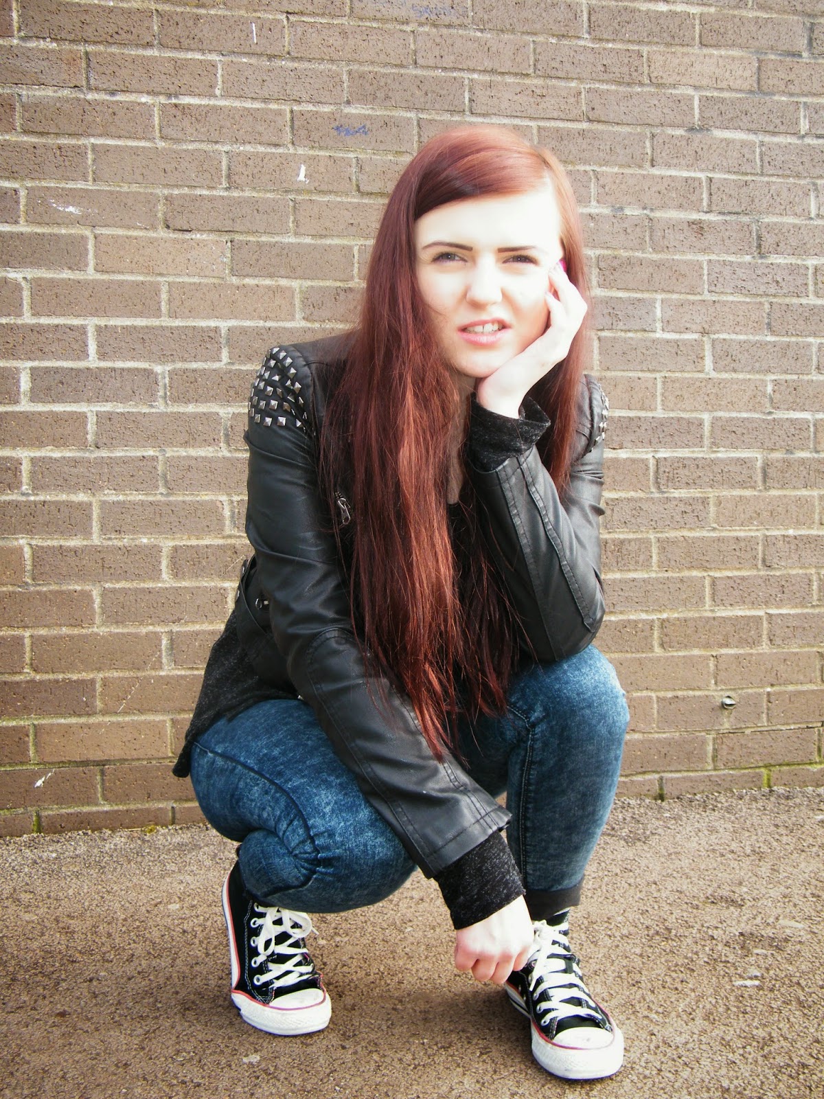
This is the original image, used on my front cover. I didnt feel the need to include props in my images, throughout my magazine. I felt the images were more effective without them, allowing complete focus on the model, themselves.

Due to my high interest in Q, my audience is relatively similar to their's: young men, pro-dominantly rock lovers, but with a hint of indie - to keep up to date. I used a number of photos, but not a huge clutter - I prefer the use of one big photo that really catches the eye of the reader.
I like to use a mix of gender in my magazine, making it appealing to male and female audiences. I found that the use of females in my magazine allowed my female class mates to enjoy reading it more than when it was pro-dominantly male. But, as you can see, I decided to keep the age of the models the same.

I chose to approach my target audience by using relative information that may interest them. For example, up to date slang words or phrases that only my generation may understand. This makes the audience feel fit for the magazine.

This is my target audience mood board - showing the type of people expected to read my magazine through a series of pictures.


As you can see, I have used both male and female in my magazine to keep both genders interested in my product. Also my target audience tend to be rock lovers, which I found from my audience research. This also relates to my choice of bands featured within the magazine, such as Blink 182, A Day To Remember etc. and my made-up band 'False Society.'

My mood board also shows what the type of people wear, which i interpreted carefully into my pictures; alot of denim wear and black clothing was used to suit the genre.  

Sunday, 2 March 2014

Front cover


This is my final draft of my front cover. Overall I'm pleased with the outcome.